Unit 4
How David Eaves teaches Unit 4 (part 2)

User Needs and Design Thinking
What is this page?
This is a detailed breakdown of how David Eaves, a Lecturer at the University College London's Institute for Innovation and Public Purpose (UCL IIPP), teaches the contents of Unit 4 of the open access syllabus developed by Teaching Public Service in the Digital Age. Read how part one of Unit 4 is taught here.
It is the first in a series of twenty-five classes that David developed originally for the Harvard Kennedy School's master and executive education programs, where he taught for eight years, and are now taught at UCL's master and applied learning programs.
We believe presenting diverse ways to teach the syllabus will help others adopt and teach the material in various contexts. See here how Konstanz University's Prof Ines Mergel teaches the same unit.
Who is this page for?
This page was developed for university faculty who teach public administrators or master's levels students in public policy and public administration. This material may also be suitable for teaching to upper year undergraduates.
Class Overview
Understanding citizens and designing effective services have always been helpful skill for public servants. In a digital era, as services move online and are freed of the constraints of paper public servants risk being more removed and distant from those they serve. As a result administrators must be still more skilled and disciplined about how they enable citizens to interact with digital era government services to, for example, prevent citizens from being overloaded with information or disinformation.
One way digital era organizations have tackled this problem, is to codify these competencies in new roles. Thus, traditional roles like project managers, who ensure projects are completed, are complimented by product managers, who seek to ensure the product or service can be easily used by citizens. This focus on citizens' experiences - elements of which make up the discipline of human centered design - should be understood and adopted by public administrators.
This class explores key design thinking concepts and discusses why good public service design matters. The readings and a pre-class exercise prompt students to use the Value Proposition chart, pushing them to reflect on the main benefits, challenges and practical implications of design thinking and user centered approaches.
This Class' Learning Objectives
By the end of this class students should be able to:
Describe some of the main activities that make up human-centered design
Explain what good design is, why it matters, and why bad design is costly and counterproductive
Understand when public servants will need to deploy human-centered design skills.
Conduct a simplified design exercise using a few human-centered design methods.
How this class relates to the Digital Era Competencies
💡 This class has a specific focus on Competency 1 - Users. See all eight competencies here.
Assigned Reading and Practical Resources
As they work through the readings in advance, students should have in mind the following questions to help them prepare for class:
What is it about the Value Proposition Design (VPD) framework that made it a useful tool to assess user needs?
What is the difference between a pain a gain in the VPD framework?
Think about a government service you use. Name at least two functional, emotional, social and supporting jobs as described in the VPD framework.
Most teams that build and run government services are well intentioned. What prevents or stops them from focusing more on user needs?
What are the skills required to be a great product owner or product manager?
Core Reading (Required)
Value Proposition Design (1999) [pages 28-61], Guide by Alex Osterwalder, Yves Pigneur, Greg Bernarda and Alan Smith for the Strategyzer Series
Building product management capacity in government part 1 – Our coaching philosophy, Bog Post by Nikki Lee and Kara Reinsel for 18F
Resources Reading (Required)
The Field Guide to Human-Centered Design (2015) [pages 9-25], Guide by IDEO.org
Government Digital Services Playbook [Play #2], Playbook by Ad Hoc
Advanced Reading (Optional)
Leading Public Sector Innovation: Co-creating for a Better Society (2010) [Chapter 7], Book by Christian Bason
A Study of the Design Process, Study by The Design Council
Principles for Digital Development [Principles 1 to 9 & About], Guide by Principals for Digital Development - design principles tailored to an international development context
A Designer’s Code of Ethics (2017), Blog Post by Mike Monteiro on Medium
Design Tweak Yields 18 Percent Rise in Snap Enrollment (2019), Article by Zack Quaintance for Government Technology
Mostly Service Design: The Health and Care Edition (2019), Blog Post by Matt Edgar
Detailed Class Breakdown
Class plan: 75 minutes
See David's slides for this class.
The segments below describe the dynamics of each part of the class. The videos were edited to only display the most relevant parts of each segment:
Segment 1 - Optional: previous assignment debrief - 15'
The goal of this segment is to provide general feedback to the class about a previous assignment.
Throughout this course, students are required to complete multiple assignments. Even though student get individual feedback, David likes to take time to share and review some of the best assignments as well as discuss common challenges students had in their submissions. The purposes are to:
Acknowledge students who did high quality work and set course expectations by showcasing peers works
Demonstrate that assignments are carefully analyzed and good work is valued
Clarify grading criteria
Help clarify concepts that didn't seem to be clear
To reinforce these messages David encourages students - if they feel comfortable - to share links to their assignments with the class.
Segment 2 - What are examples of design thinking?- 10'
The goal of this segment is to an introduction to design thinking and user centered approaches and the skills and practices they entail.
Purpose of segment
When you ask students to consider design thinking, they commonly assume it is about making products look more attractive. However, a government website or digital service can simultaneously look aesthetically beautiful and be difficult to navigate or use. In this segment instructors should push students to reflect on the skills and practices needed to both understand who it is they are serving and to make it easy for citizens to benefit from public goods.
To inspire this reflection David first shows students some example of design thinking in action and then uses prompts to get students to discuss the topic.
Examples
An effective way of starting this segment is to show examples of products and services students can relate to which prioritize aesthetics or other goals over citizens/users needs and examples that get it right. As a first example, David shows a cartoon that jokes about university websites not reflecting what their users most want while navigating.
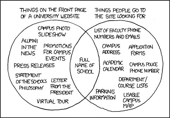
Cartoon showing a venn diagram of two overlapping circles. The point of the diagram is to show how what users want from a university website homepage and what universities put on website homepages only overlap very slightly. The point is to show how user needs are often ignored in the production of websites.Thank you to XKCD for licensing this comic CC2.5
The second example refers to the chess game - developed by Apple and that comes default on every mac device. This example is wonderful in that it highlights how a good user experience is not always about the visual element of a product or service. Humorously, the developer documented how a piece of code purposefully prevents the chess computer from moving too quickly to make foster a more positive experience and encourage engagement. This is a powerful example that user focus isn't always about aesthetics or efficiency. It also raises interesting questions of ethics in user experience for the class to discuss.

A snippet of software code. In a comment within the code the programmer has written "Paradoxically enough, moving as quickly as possible is not necessarily desirable. Users tend to get frustrated once they realize how little time their Mac really spends to crush them at low levels. In the interest of promoting harmonious Human - Mechine relations, we enforce minimum response times." Source: open source Apple chess code base
Debrief and Discussion
Referring to the readings, David asks students to reflect on the following questions:
What is human-centered design and how do you define it?
What are the core skills and competencies associated with design thinking?
Instructors should, of course, focus on issues they believe to be most salient. Some possible highlights include:
Public administrators are typically not the end users of the service and their assumptions about how citizens want to interact or use the service are often wrong. As a result, respect and humility are two of the most important skills for digital era public servants seeking to design services effectively.
While having empathy for users is critical it is not sufficient. It is necessary to design services with the direct engagement of users, to shadow them using our services, and to ask the right questions
Teams risk focusing their user research on quantitative approaches - such as looking at website metrics or call center wait times. While quantitative data is important, individual qualitative interviews and observing users can be as, and sometimes more effective, as surveys or quantitative analysis.
When developing digital era services, there is a constant risk that technological improvements, social changes, and other factors will cause a given service to suffer from what David calls the "entropy of crappiness." Problematically, teams in charge of services will either not notice the degradation of a services usability or worse, not conduct a new round of user research as they upgrade the service. In the same way the software never ends, human centered design requires a non-linear and continuous journey of interaction with users.
Video of David teaching this segment
Segment 3 - Reflecting on the assignment - 30'
The goal of this segment is to describe some of the main activities that make up human-centered design through the reflections on a Value Proposition pre-class assignment.
💡 *Previous to this class, students had to complete an assignment (see here) in which they complete the Value Proposition Design template for KNET - Harvard Kennedy School's intranet.
A note on the Value Proposition Design template and its role.
David likes to use the Value Proposition Design template not because it is necessarily the best tool for user centered design - but because it can be easily understood and allows students who are not designers. With minimal training it conveys many key concepts (see video) and, most critically, organizes them in a structured way that makes it both easy to understand and easy for relative new comers to communicate to others. Instructors should, of course, use a methodology and/or tool they are most comfortable or aligned with.
A note on an appropriate digital service as the subject for this assignment
David uses KNET because his students come from over 40 countries and have few shared experiences with online services - particularly during a pandemic. As a result university digital services present a unique unifying experience that anyone in the class can be "expert" on and whose experiences can be shard and understood by others.*
Instructors should choose a website or service students in their class are familiar with.
Purpose of this segment
As theory, human-centered design is not hard to grasp, but as a craft it requires dedication and practice to master. Often a core challenge of design thinking is asking the right questions - deeply understanding what the problem is that citizens are trying to solve. In addition, the government context adds complexity. Governments cannot "pick" their users - they have to find ways to serve everyone. This can mean dealing with, and prioritizing, multiple user profiles.
Discussion Questions
To start this segment, David breaks students into groups for 10 minutes to discuss the following questions:
What was easy/hard about the Value Proposition Design (VPD) process?
What did you learn about users?
What did you learn about administrators?
Given students often agree about the aims of user focused design, the purpose of these questions is to surface what makes the practice of focusing on and designing for users difficult.
Debrief
In the debrief, some common challenges include
having more than one type of user;
having to prioritize features or service;
asking the right questions and testing hypothesis about what still doesn't exist.
This is a good moment to get students from different disciplines to share their perspectives. For example, David asks for design students to give their opinion and contrasts that with those of the policy students. Even in a class with students of a single discipline, it can be invaluable to highlight how views from people with different experiences and backgrounds can add diversity and depth to how the group might address these challenges. The goal is to emphasize the benefits of a multidisciplinary approach and a diversity of views when tackling these issues.
Video of David teaching this segment
Segment 4 - The costs of a bad design - 5'
The goal of this segment is to highlight the innumerous costs of a poor design.
Purpose
Digital era public administrators should be able to recognize and, to some degree, quantify, the costs of poor design. One challenge is that poor design is rarely intentional. Most often it is the result of conflicting goals. Administrators may be trying to satisfy the needs of a too many users or stakeholders. Or they may be optimizing for administrative efficiency, not accessibility.
The reality is that poor design has real human, social and economic costs, and policy makers and public administrators need to reflect on these costs.
Discussion
In this short segment, David asks students to brainstorm costs they can foresee in operating a poorly designed service or product. Ideally students would do this by reflecting on a concrete example, such as the example covered within students pre-class assignment (e.g. what are the costs of poor design in KNET? how might you measure those costs?).
A key message to convey to students is that sometimes these costs are not exposed and one of the roles of a public administrator is to surface them and make them clearer to stakeholders.
💡 David will be the first to admit that in the video below, he ran short on time in this class and did not give this segment the time it deserved.
Video of David teaching this segment
Segment 5 - Why is it hard to focus on the users? - 10'
The goal of this segment is to reflect on the practical obstacles to focusing on users.
Purpose of this segment
Even when public administrators want to improve citizens' experiences, other priorities and goals can distract from this ambition. For example, the workload involved with adopting a new technology and responding to political goals (divorced from concrete user needs) can impede good design work. This segment draws attention to common causes of bad service design so that students can prepare for mitigating them.
Reflections
This segment has an expository nature, and instructors should focus on the discussion of four pressures that make it harder for governments to focus on citizens:
Excitement about a new technology can cause organizations to prioritize adoption of that new technology. This new tool can then be deployed into service irregardless of whether it serves any real user needs. Instructors can use this opportunity to provide examples where governments get excited about using a certain technology and try to find a problem to apply it, while the inverse should be the correct practice. (This might include... any effort to use blockchain on pretty much any government service)
Governments often have user experience challenges that are more challenging than those face by private sector actors. For example, government service most often have to work for everyone, not a narrow (and likely profitable) subset of the population. Instructors can explore the difficulties of managing content and priorities in a politicized context.
Public servant's intuition about what is best for a user is not always right. For example, many public servants have decided that something that the public really wants is 'One Stop Shops' - websites or physical locations that offer to solve many problems through one service interface: MyBenefits CalWIN from an earlier class is a good example of this. Although this may seem like a good choice at first glance, there are several private sector examples that suggest this isn't always what users actually want. Google and Microsoft have multiple narrowly focused apps. Google does not provide Maps (and Waze), Mail, Sheets, Docs, Drive in a single application. And Microsoft office - both on the web and on mobile - is not an "app." Instead there is Outlook, Word, Excel, etc... all of which can be downloaded and used independently. This approach is more intuitive and easier for users.
Video of David teaching this segment
Segment 6 - Final reflections - 5'
The goal of this segment is to bring together the learnings from this class.
In this segment, students should reflect on the key messages learned in class. In the video, David goes directly to a slide with his takeaways because he was running out of time, but in an ideal class facilitators should let students have individual reflections first.
The takeaways that David likes to highlight are:
Human-centered design is a skill and process at public servants' disposal
The work of a public servant in a digital era requires thinking about citizens and deeply understanding their needs
Start with citizens' needs, connect them to policy and choose a vehicle or technology only at the end (don't start with an exciting new technology)
There are political and bureaucratic obstacles and opportunities involved in the process
Video of David teaching this segment
Common questions from students faculty could prepare for:
- What are the differences between pains and gains?
How can you get support teaching this unit?
We're dedicated to helping make sure people feel comfortable teaching with these materials.
Send a message to mailbox@teachingpublicservice.digital if you want to book in a call or have any questions.
You can also connect with David on LinkedIn.
What are your rights to use this material?
We have developed these materials as open access teaching materials. We welcome and encourage your re-use of them, and we do not ask for payment. The materials are licensed under a Creative Commons Attribution 4.0 International License.
If you are using any of our syllabus materials, please credit us on your course website using the following text:
We are proud to use the Teaching Public Service in the Digital Age syllabus in our curriculum and teaching. Developed by an international community of more than 20 professors and practitioners, the syllabus is available open-source and free at www.teachingpublicservice.digital
Why was this page created?
This teaching material forms part of the Teaching Public Service in the Digital Age project. Read more about it here.
Acknowledgements
David Eaves would like to note that this material was made possible by numerous practitioners and other faculty who have generously shared stories, pedagogy and their practices. David is also grateful to the students of DPI 662 at the Harvard Kennedy School for enriching the course and providing consent to have the material and questions shared. Finally, an enormous thank you must be given to Beatriz Vasconcellos, who helped assemble and organize the content on this page.